Games have to be the ultimate user-driven application: they don’t actually provide any useful service beyond what the player perceives (well, unless you’re in the RMT industry). You’d think that because of this, games would have some of the most well-designed user interfaces out there - but it seems like a lot of the time, this is nowhere near the case.

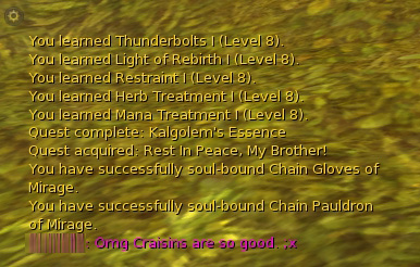
Unless moused-over, the background of the Aion chat window is always completely transparent.
I’m going to take Aion as an example, mostly because it’s game I’ve most recently had irk me in the UI department. Specifically, the chat box. Why is there no way to customize the opacity of the box? And even worse, why is there no way to make it stay opaque? MMOs are social games, and the chat system is a key aspect of that - yet trying to read multicolored text rendered through a transparent window with the vibrant colors of Aion’s world behind it is probably going to give me eye strain if I attempt to do it for more than ten minutes at a time.
Another more general example is blank space in UI layout. While jamming everything together with no spacing at all doesn’t work, and not having backgrounds at all is even worse (see above!), quite a few UIs just toss screen space out the window at alarming rates - especially frustrating if you’re not playing at a huge resolution.

An example of a status bar window that uses far more space than appropriate.
The example image from Lineage II above at least has the saving grace that blank space is generally semi-transparent, so it’s not completely blocking out your view of the world - but it’s still distracting. It wouldn’t take any complex coding to lay the window out in such a manner that there was less of a void surrounding the actual functional elements.
These kind of things are just simple design considerations - there’s not really a game mechanic justification for them, there’s no excessive programmer time involved, just basic things that could have been done slightly different and improve the game experience.